Unsolicited Capcom Unity website redesign
Posted on 19th August 2014
Every now and then I have to scratch a creative itch - I see something that's not very good, but has the potential and the content to be great, and need to do something about it. The compulsion to put two things together (my pixel-pushing and their content) is irresistible. Usually that happens in the form of a website, but it also has a curious side effect of making me very good at buying birthday presents.
Scroll down for the pretty stuff, but first, some caveats.
This is not a full redesign - there are a million and one things that I've missed that may be more important than the things I've focussed on - think of it more as a potential style guide than a rock-solid, ready for development, design. Given the lack of quality of the design of Capcom-Unity.com as it stands, this is merely a starting point for a discussion.
This was a quick process, direct from brain to screen, with very little of what you'd actually do in terms of wireframing, UX, actual talking to the people who own the brand about what they want. You know, the small stuff. I whole-heartedly agree with what Paul Adams is saying in his article 'The Dribbblisation of Design. That said, I've designed and built enough websites, big (huge) and small, at this point to be able to mentally skip some of that process in fun projects like this.
Capcom have lots of websites, both for corporate use and individual games, but Capcom Unity is the more interesting of them, as it's tied to user generated content, seems bigger in scope, and isn't just brochureware (of Capcom's sites, only Capcom Vancouver has styled itself outside of 2006).
So. When you think of Capcom, you probably think of a few things; Street Fighter, Resident Evil, Megaman, Devil May Cry - hell, maybe even Dragon's Dogma (you connoisseur, you). Great games with amazing visuals, strong branding and characters - things you'll happily spend hours entertained by.
So why, with all this amazing content, does Capcom Unity do such a bad job of presenting it? Go have a look around for 5 minutes and then come back. I'll wait.
See what I mean?
I could critique it for hours, but I won't - my arguments are usually better formed with pixels than words - so, in between hunting for a new job (booo redundancy. want me?), I put some ideas down over a few days and came up with this (click for the original images):
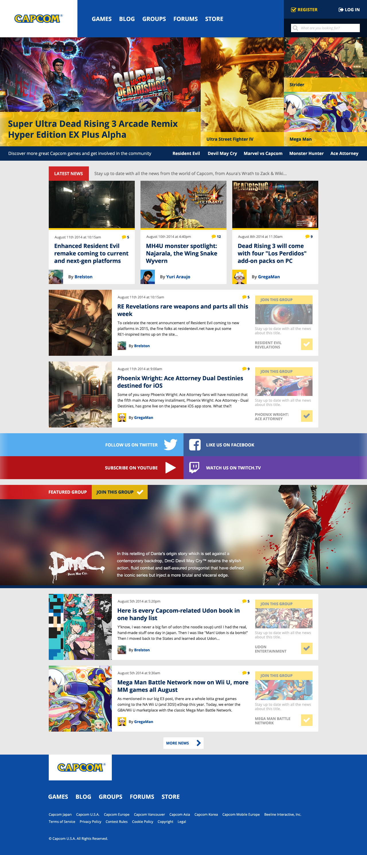
Homepage
The homepage does away with the carousel at the top (not that you'd even know it was a carousel on the current site) and the big list of articles, and in its place showcases a few games and stories in a much more readable and interesting way.
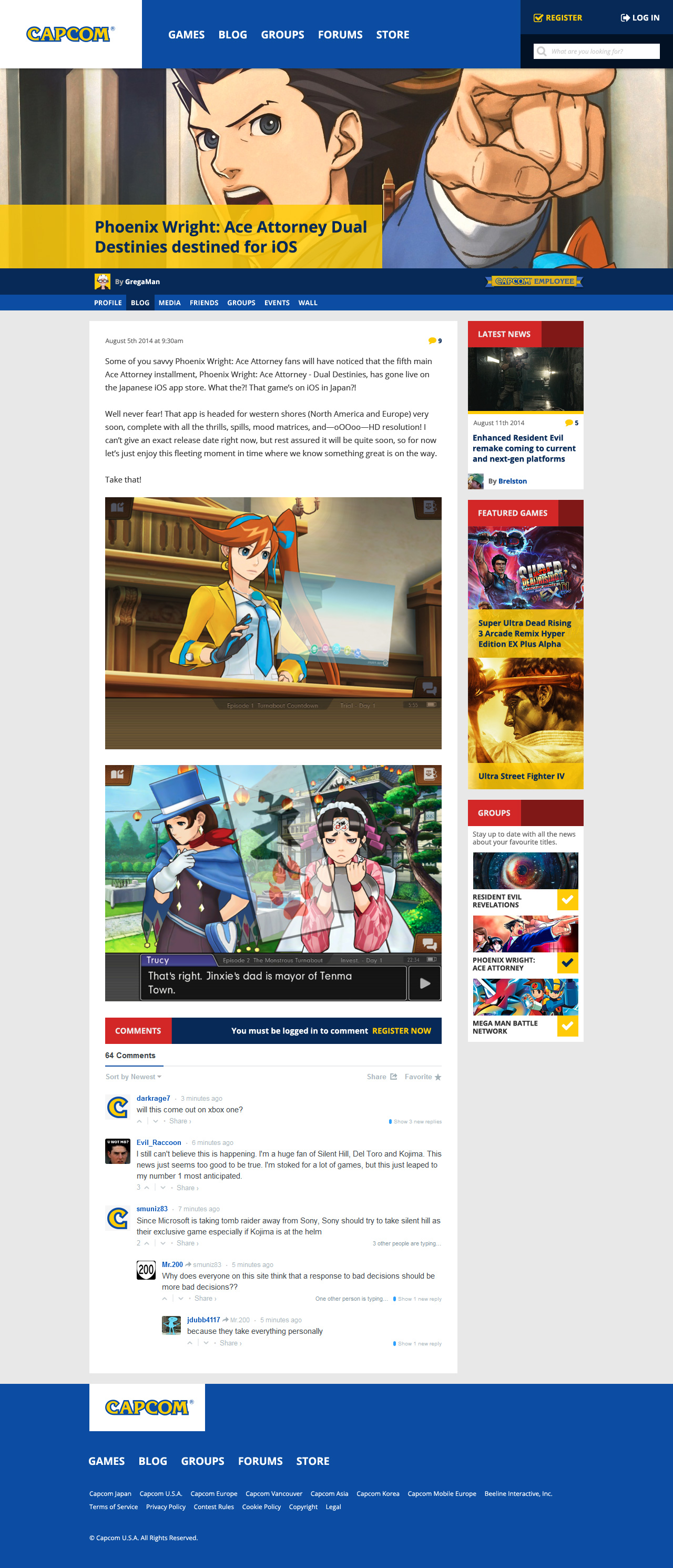
Blog article
Full width header images are lovely, aren't they?
Group page
Group homepages are admittedly something that could be handled in lots of different ways - I went for impact, but they could be focussed on the activity list and the user content more, I guess.

Games listing
The existing way or browsing games on the site was a major influence on why I started doing this in the first place - that pop-up window is horrible to use - featuring the core part of your business should be a top priority!

So, there you have it. Pull it apart if you want, but I see this more as art than design, given it's with no understanding of what and how Capcom and their users interact with the existing site. If your initial reaction is "ooh, that's pretty", then I'm happy. Your next reaction might be "wait a minute, he's not thought about...", in which case, post a comment and we can have an internet fight.
tl,dr; I made Capcom-Unity.com look pretty in my spare time. Maybe they should hire me to build it for real.
Share me: http://p14.co/x/147f9xs